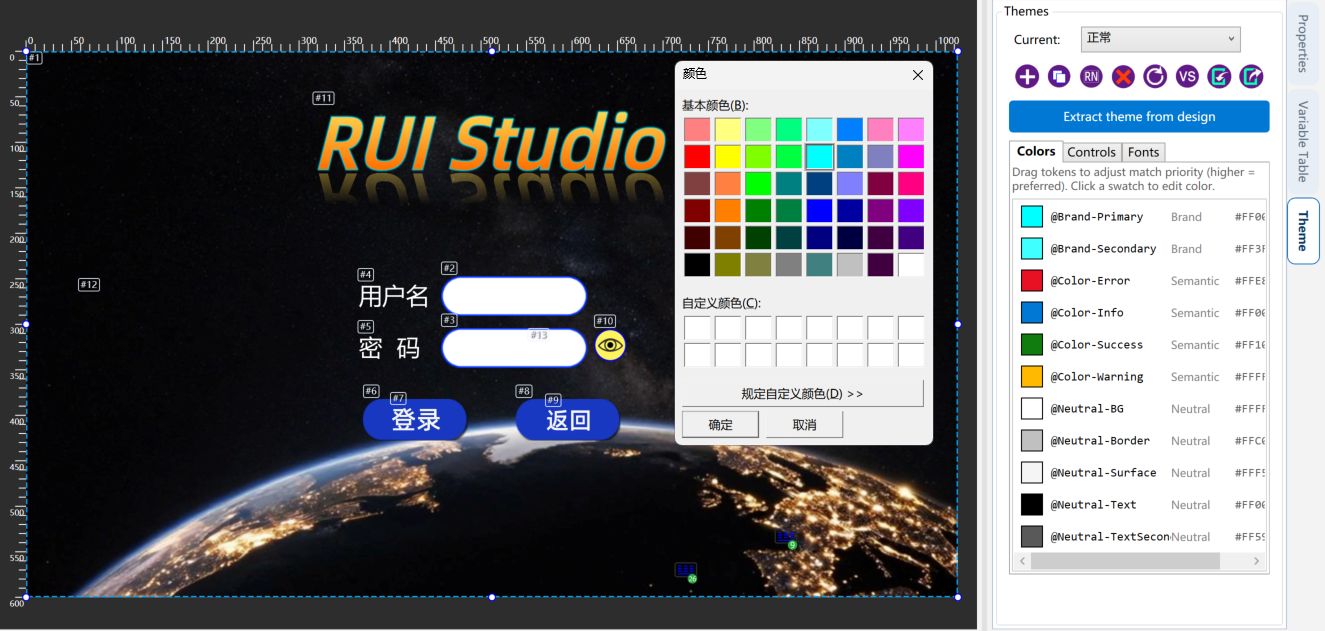
Main window layout
Left pages and execution list; right properties, variables, and theme.
The canvas is in the middle. Vertical tabs sit on the left and right; drag the splitters to resize. 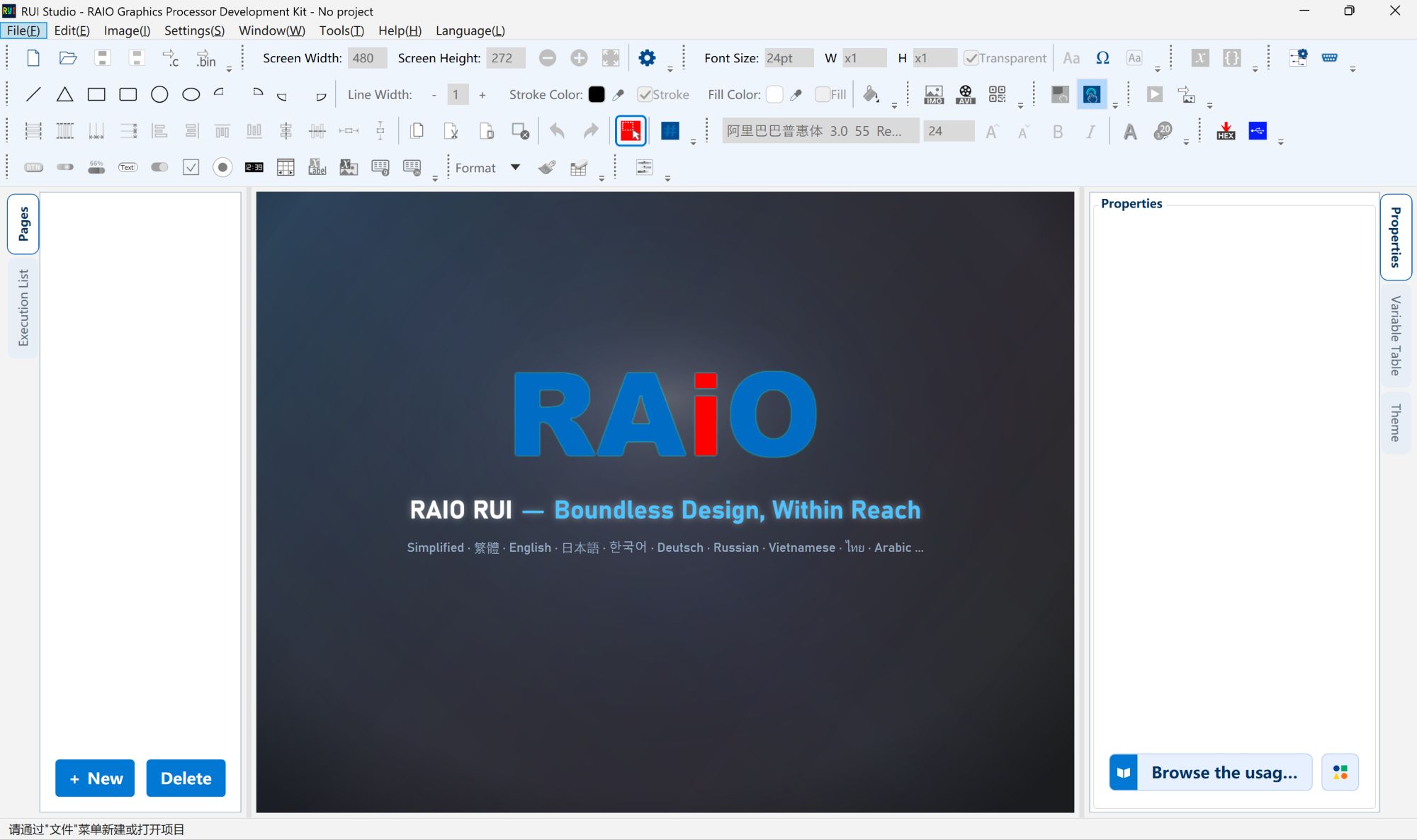
Left: Pages
The Pages tab lists every page thumbnail and name. Click one to edit it.
- + New and Delete at the bottom.
- Drag to reorder. Touch “Jump page” uses the 0-based index in this list; the app remaps after a reorder, but check targets before export.
- Each page has its own elements and execution list. Undo is per page — see Undo and Pages.
With a page selected and nothing on the canvas, Properties shows page properties (for example full-page flick). 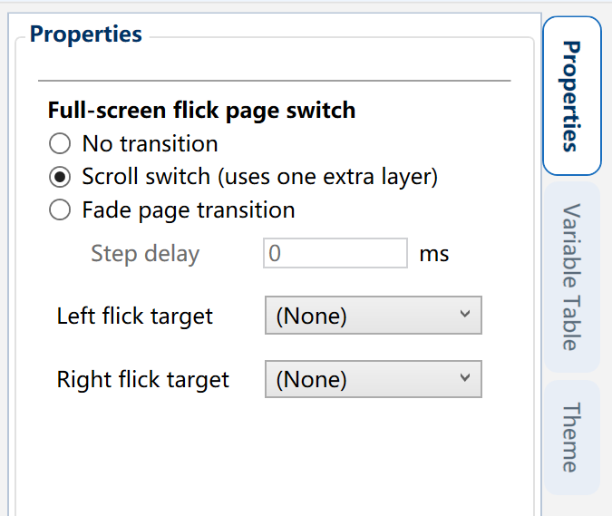
Left: Execution list
The Execution list is the draw / export order of the current page, not the undo stack.
Two columns: Index and Action (place image, rasterize, crop bitmap, and so on). 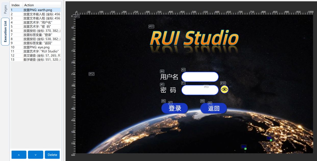
- Click a row to select that element on the canvas.
- Move up / down or drag to change stacking: later entries paint on top; packing and
Page_Renderfollow the same order. - Delete removes the element (same idea as delete on the canvas; undo works).
- The toolbar can show # badges on the canvas (touch areas use a separate overlay toggle).
Unregistered-font export messages use this #.
Right: Properties
The Properties tab follows the selection:
| Selection | You see |
|---|---|
| One element | Position, size, images, bindings, output format, … |
| Several similar elements | Shared fields (dropdowns may be empty if values differ) |
| Page only, no element | Page properties |
? next to a field explains it. The footer opens online help and shortcuts. After placing something, edit numbers here — Place controls. 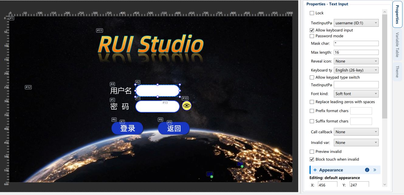
Right: Variable table
The Variable table tab is a read-only look at project variables: name, type, initializer. Click a row for a tip; double-click or right-click Edit this variable to open full Variable design (VP, arrays, min/max, digit widths).
Control dropdowns use this table order. After rename or reorder, check bindings on controls. 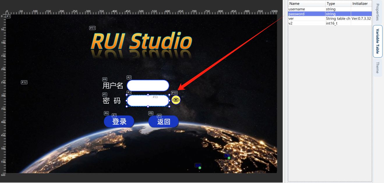
Right: Theme
The Theme tab (Theme management) is project-wide color and skins, not a single element.
Typical actions:
- Current theme: bound fills/strokes update when you switch.
- Add / copy / rename / delete (keep at least one).
- Color tokens: brand / semantic / neutral; bind colors in Properties.
- Control layer: apply a style pack by control type; skins change, size stays when possible.
- Font layer: theme font bindings.
- Extract theme from the current design, import / export, compare, reset.
After a theme change or extract, pack images again before firmware export so merge enums stay in sync.